Transactional emails are the ones you can’t afford to get wrong. A receipt, a verification code, a password reset, a failed-payment notice — these are triggered by something the user just did, which means they get opened. Transactional email consistently carries the highest open rates of any email type, often 2-3x a marketing campaign, because the reader is waiting for it.
That attention is a gift most SaaS teams waste. The default transactional email is a sterile wall of data pushed out by a billing system or auth provider, with no thought given to trust, clarity, or the relationship. The best ones treat the moment as a design problem: how do I confirm the fact, remove the friction, and leave the reader more confident in the product than before they opened it?
Below are 12 real transactional emails from Stripe, Calendly, Slack, Zapier, Canva, Adobe, and more — grouped by the four jobs transactional email actually does. Each is annotated with the specific pattern you can lift.
TL;DR — what makes a transactional email work
The best transactional emails almost always do three things:
- Confirm the fact first. Lead with what happened — “payment received,” “here’s your code” — before any branding, upsell, or explanation. The reader opened for one piece of information; give it to them in the first line.
- Remove friction at the completion point. Put the verification code in the subject line. Offer both a button and a copy-paste link. Name the exact subscription that failed. Every second between intent and done is a second the user can drop off.
- Reinforce trust, don’t sell. Transactional emails are legally and psychologically distinct from marketing. Adopt the plain, system-level language users associate with legitimacy — and resist bolting a promotion onto a receipt.
What is a transactional email?
A transactional email is an automated, one-to-one message triggered by a specific user action or account event — a purchase, a signup, a password request, a failed charge. Its purpose is to deliver information the user needs right now, not to market to them.
That distinction matters for two reasons:
- Deliverability. Transactional email is typically sent through a separate stream (or separate provider) from marketing, and most jurisdictions exempt it from unsubscribe requirements precisely because the user needs it. Mixing promotional content into a transactional email can put that exemption — and your inbox placement — at risk.
- Expectation. The reader opened this email to complete a task or confirm a fact. Anything that delays that outcome (a hero image, a product pitch, a survey) works against the one job the email exists to do.
The 12 examples below cover the four transactional jobs that show up in nearly every SaaS: payment receipts, email verification, password resets, and failed-payment notices. Steal the format that matches whatever your system just triggered.
Payment receipt email examples
Calendly — “Your receipt from Calendly LLC”
Subject line: Your receipt from Calendly LLC
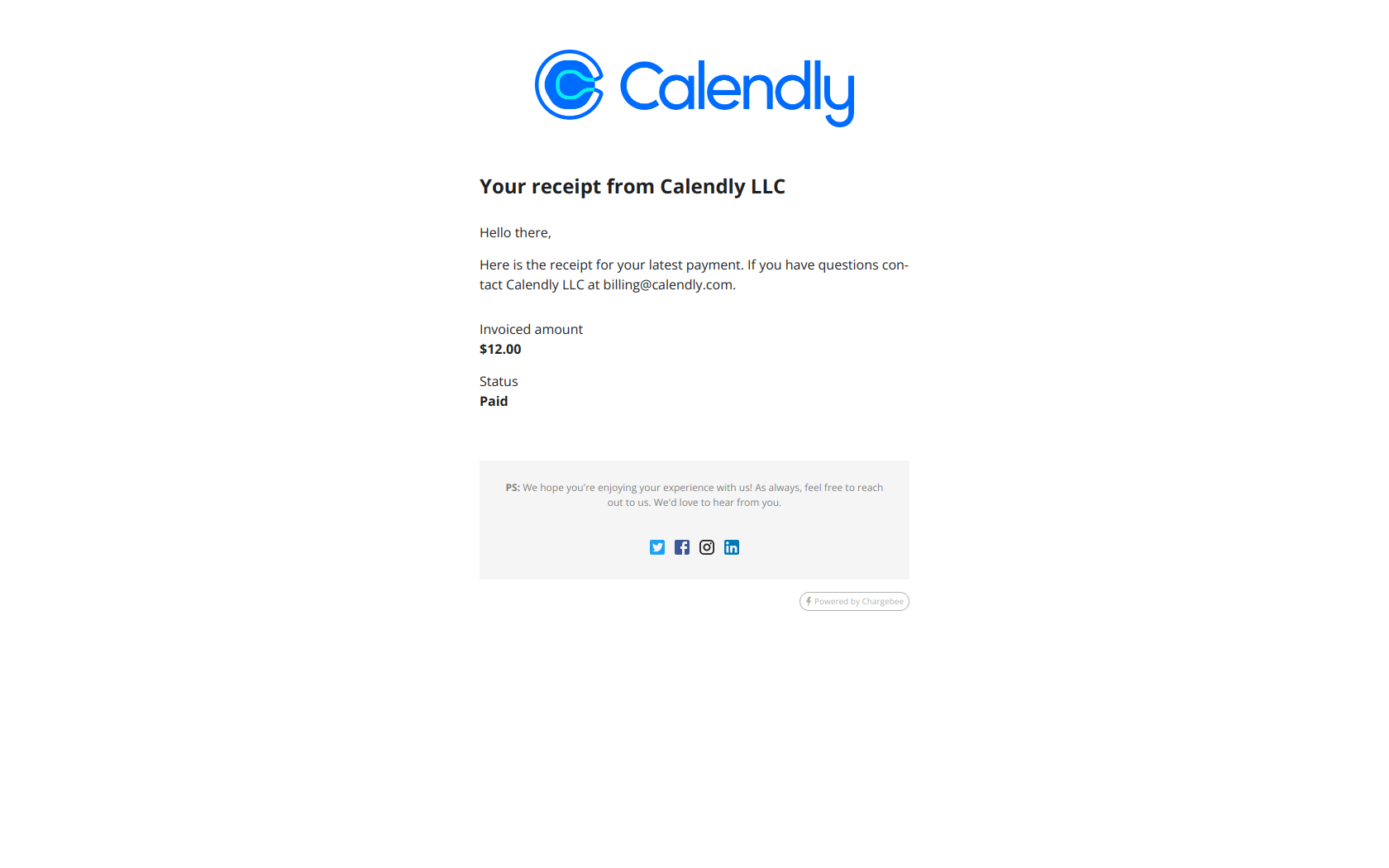
Calendly’s subject line reads like something from a bank statement, not a marketing team — “Your receipt from Calendly LLC,” legal entity and all. That’s deliberate. When money leaves someone’s account, the first thing they want is confirmation that the charge is legitimate and expected. The body follows through: a clean invoice summary, the amount, a “Paid” status, and a support link if something looks off.
The pattern: adopt the language of the system being confirmed. When you mirror the plain, official phrasing users already associate with financial records, the email reads as trustworthy the instant it lands — no persuasion required. Save the personality for emails where you’re actually asking for something.
Buffer — “Thank you for your payment and support!”
Subject line: Thank you for your payment and support!
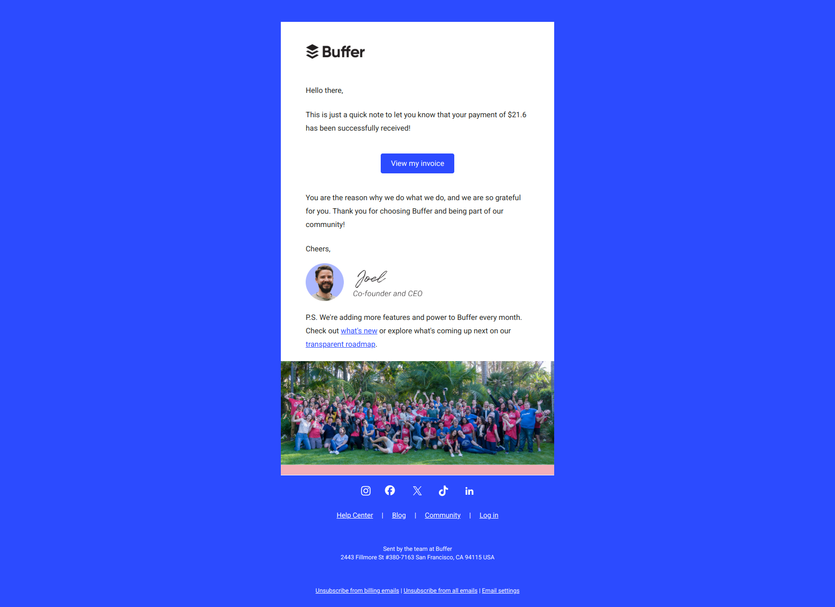
Buffer inverts the usual receipt. The subject thanks the customer before confirming the charge, and it’s signed “Joel from Buffer” — a human, not a billing robot. The payment details are still all there, but they arrive wrapped in gratitude rather than accounting.
The pattern: gratitude before information. A receipt is one of the few moments a paying customer is guaranteed to open your email — treat it as a retention touchpoint, not just a compliance artifact. Acknowledging the relationship before the transaction turns a routine charge into a small reminder of why they signed up.
Canva — “Your Canva invoice”
Subject line: Your Canva invoice
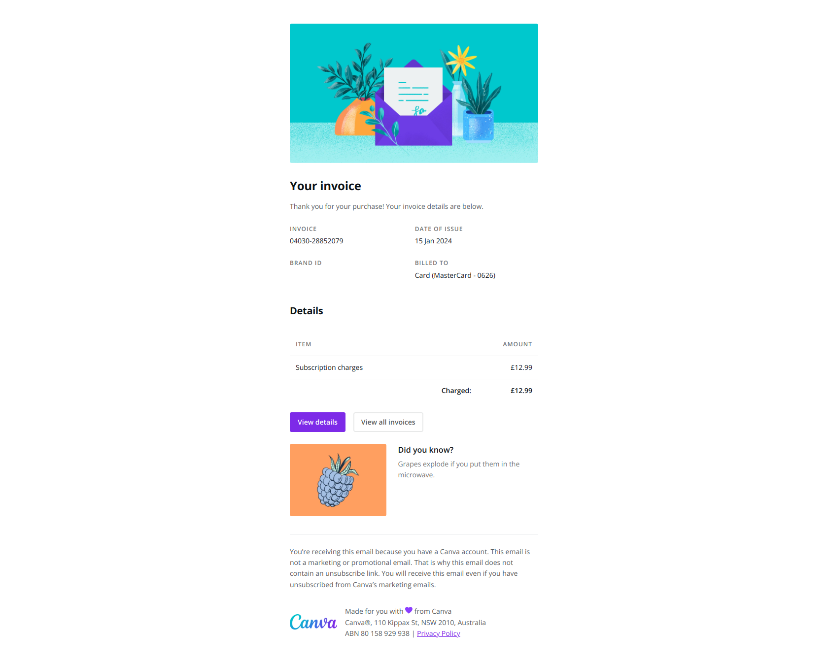
Canva’s invoice does everything a transactional email must — invoice number, issue date, payment method, itemized charges, a link to past invoices — and then does one thing it doesn’t have to: it drops in a small fun fact. It’s a tiny flourish inside a document users expect to be completely sterile, and it keeps them in-brand for a few extra seconds.
The pattern: humanize required friction. The data has to be there and has to be skimmable, but a single moment of personality inside an otherwise-boring email interrupts the delete instinct. Just keep it small — the invoice still has to function as an invoice.
Loom — “Thank you for your payment”
Subject line: Thank you for your payment
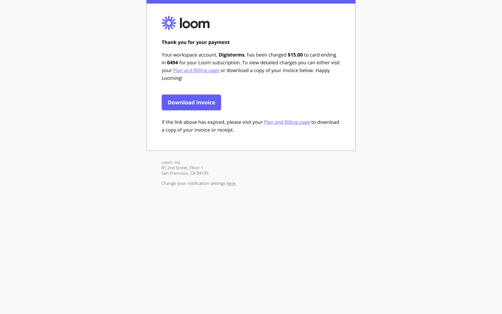
Loom leads with “thank you” before naming the $15.00 charge to the workspace, then makes the practical stuff effortless: view the detailed charges, download the invoice, manage notification settings — each a direct link. It reframes the moment of seeing a charge, which can trigger a flash of “wait, what’s this?”, as an acknowledgment of the customer’s commitment.
The pattern: acknowledge the relationship before the transaction. Especially for recurring subscriptions, a receipt is a monthly moment where churn anxiety can surface. Opening with gratitude — then making the invoice and billing controls one click away — defuses the anxiety and strengthens retention instead of just proving the charge cleared.
Email verification examples
Stripe — “Verify your email address”
Subject line: Verify your email address
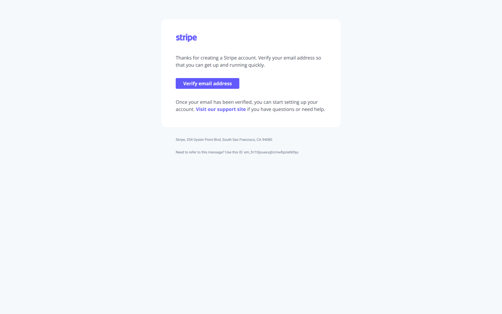
Stripe’s verification email is almost aggressively single-minded. The one required action — verify email — is the first and most prominent thing on the page, ahead of any onboarding guidance, feature tour, or welcome copy. Nothing competes with the button.
The pattern: gate progress on completion, not education. New users have finite activation momentum, and every competing element on a verification screen is a chance to lose them before they’ve confirmed identity. Make the required action unmissable and non-negotiable; the product tour can wait until they’re actually in.
Slack — “Slack confirmation code: XTI-IU8”
Subject line: Slack confirmation code: XTI-IU8
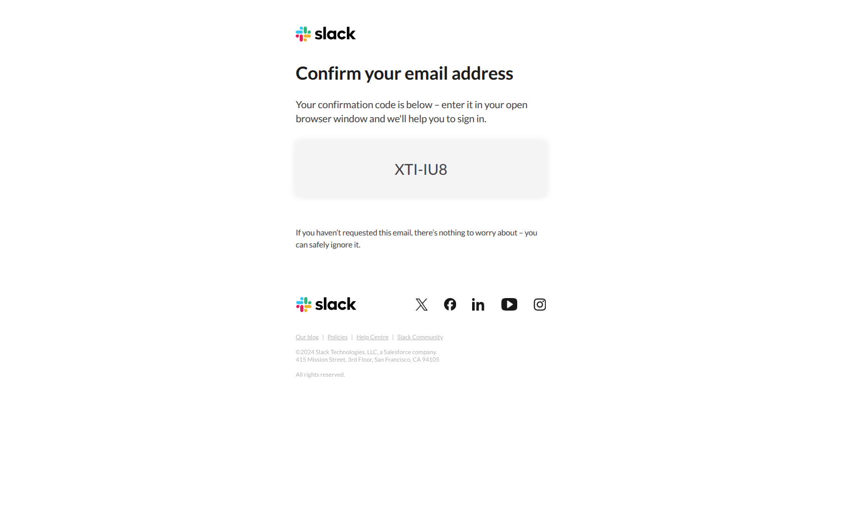
Slack puts the actual confirmation code in the subject line. A user can glance at their notification, read the code, and type it into the app without ever opening the email. It’s the shortest possible path between “I need to verify” and “done.”
The pattern: make the critical action visible in the subject line. For time-sensitive verification, completion rate matters far more than open rate — and every step you remove (opening the email, finding the code, copying it) is a step where the user can get distracted. Surfacing the code in the subject collapses the whole flow into a single glance.
ClickUp — “ClickUp Verification Code: 7499”
Subject line: ClickUp Verification Code: 7499
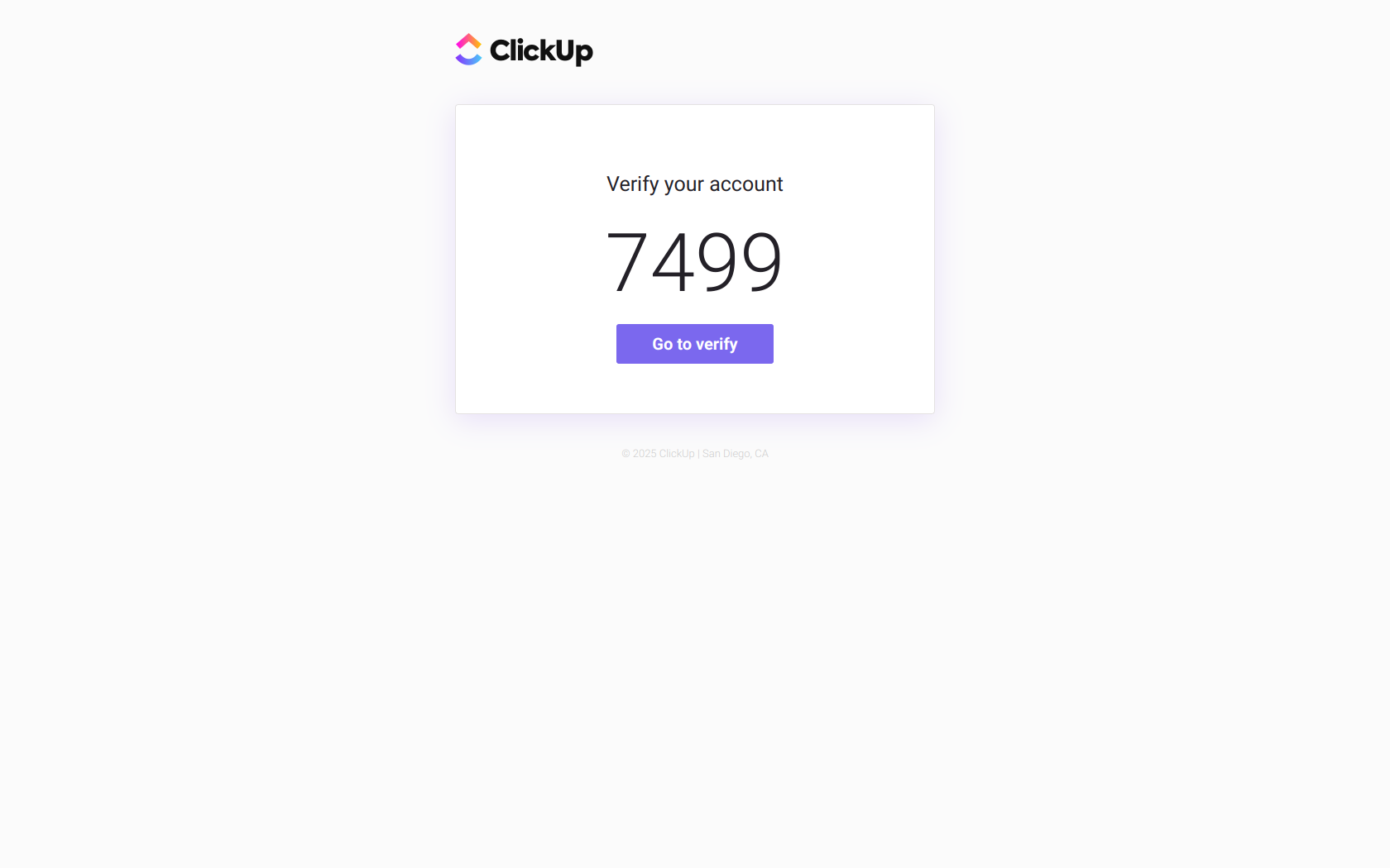
ClickUp hedges against every user’s preference. The code appears in plain text near the top so impatient users can copy-paste it immediately, and there’s a prominent verification button for anyone who’d rather click through. The layout is minimal — logo, code, button — with no promotional content diluting the security moment.
The pattern: give the user two paths to the same outcome. Some people trust a code, some trust a button; forcing everyone down one path adds friction for half your users. Offering both — code and action button — meets people where they are and closes the gap between intent and completion.
Customer.io — “Confirm your Customer.io account”
Subject line: Confirm your Customer.io account
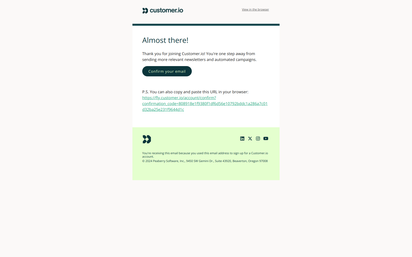
Customer.io resists the temptation to sell. The single friction-free action — confirm your email — sits front and center, rather than buried under a list of product benefits or onboarding promises. New users complete verification while their signup momentum is still high, before the pitch has a chance to stall them.
The pattern: remove all competing actions before the conversion point. On a verification email, completion speed determines whether a user ever reaches your product at all. Anything you add above the confirm button — value props, feature highlights, “here’s what you can do next” — is a competing action that slows the one thing that has to happen first.
Password reset email examples
Zapier — “Zapier Password Reset”
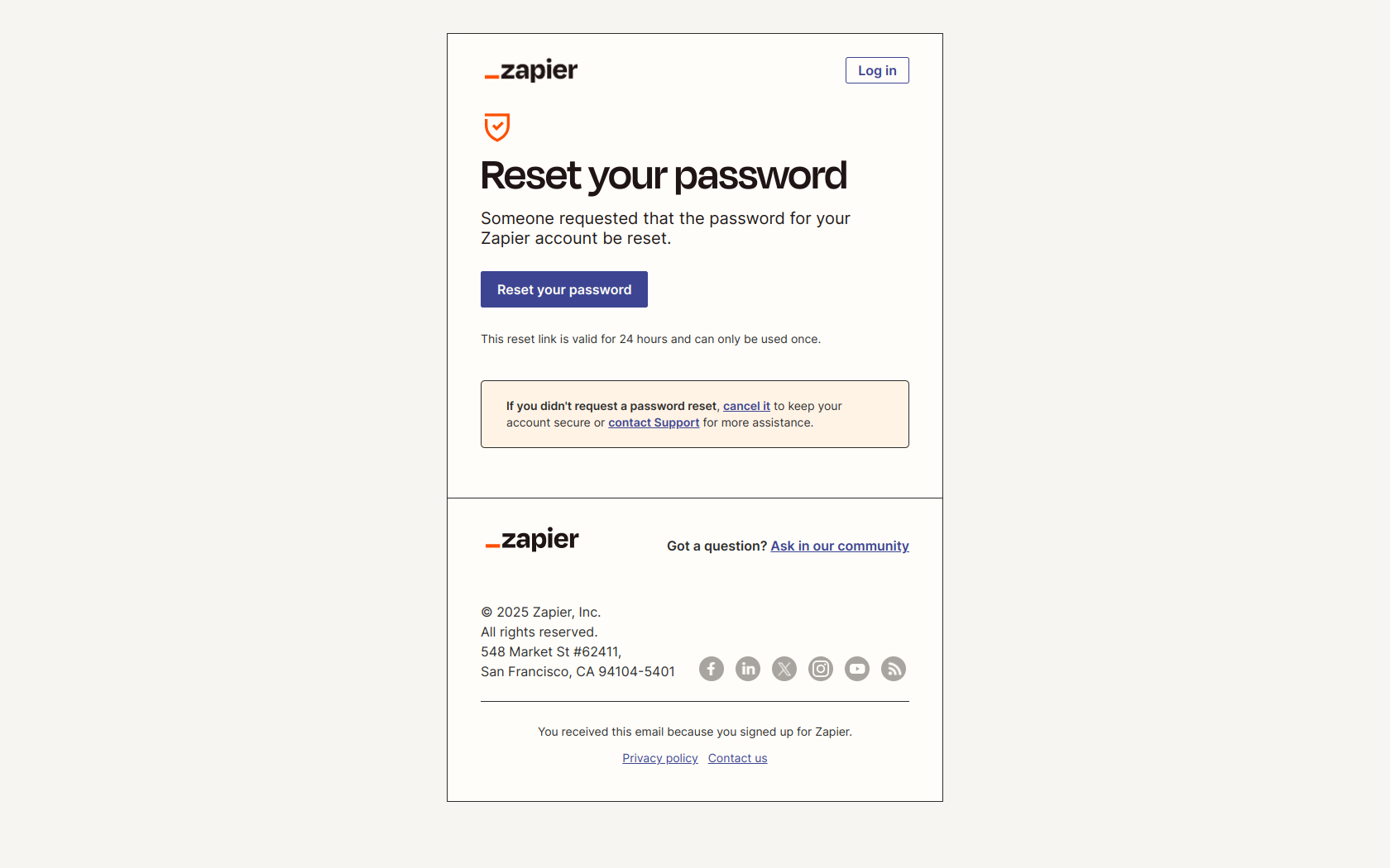
Subject line: Zapier Password Reset
Zapier’s reset email opens with a flat statement of fact — a password reset was requested — rather than a warning or an alarm. Then it gives two clear options: a reset button (with its validity window noted) and a way to cancel if the request wasn’t the user’s. The neutral tone lets the reader assess legitimacy calmly instead of reacting to a scare.
The pattern: state the fact before the ask. Password emails are a prime phishing target, so users are primed to be suspicious — and an alarmist tone reads more like a scam, not less. A calm, factual “here’s what happened” lets legitimate users act on intent while giving anyone who didn’t request it an obvious, low-stakes off-ramp.
Make — “Reset your Make password”
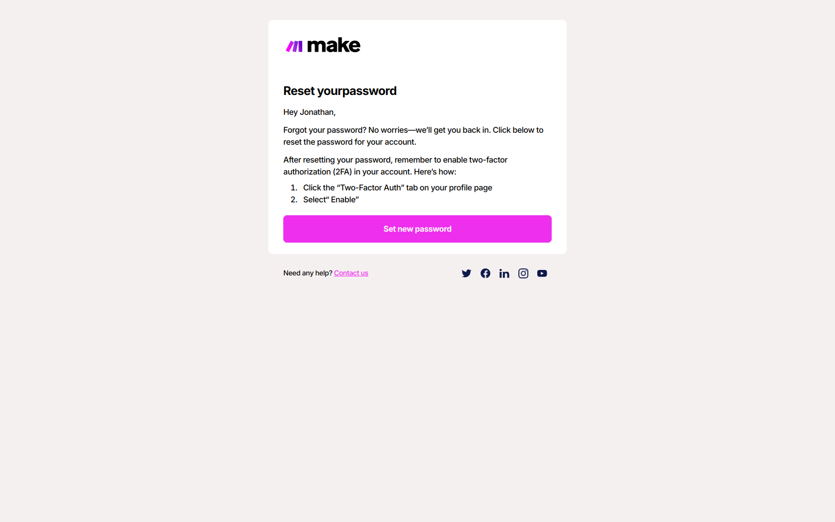
Subject line: Reset your Make password
Make handles the reset cleanly — named greeting, single reset button — and then adds a second, softer ask: enable two-factor authentication, with brief instructions. Crucially, the 2FA nudge comes after the reset action, so it reads as a helpful next step rather than another hurdle between the user and their account.
The pattern: solve the immediate friction first, then layer in the defensive behavior. A user mid-recovery has already proven they’ll take one security action — that’s the ideal moment to suggest the higher-friction one (2FA). Lead with it and you overwhelm them; sequence it after the reset and it feels like the product looking out for them.
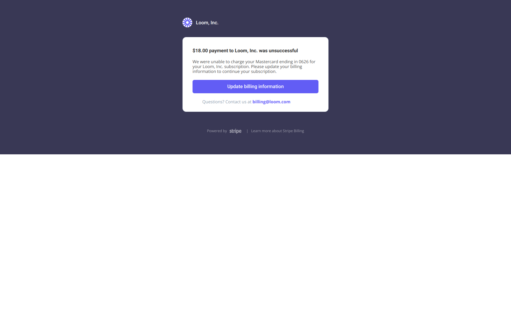
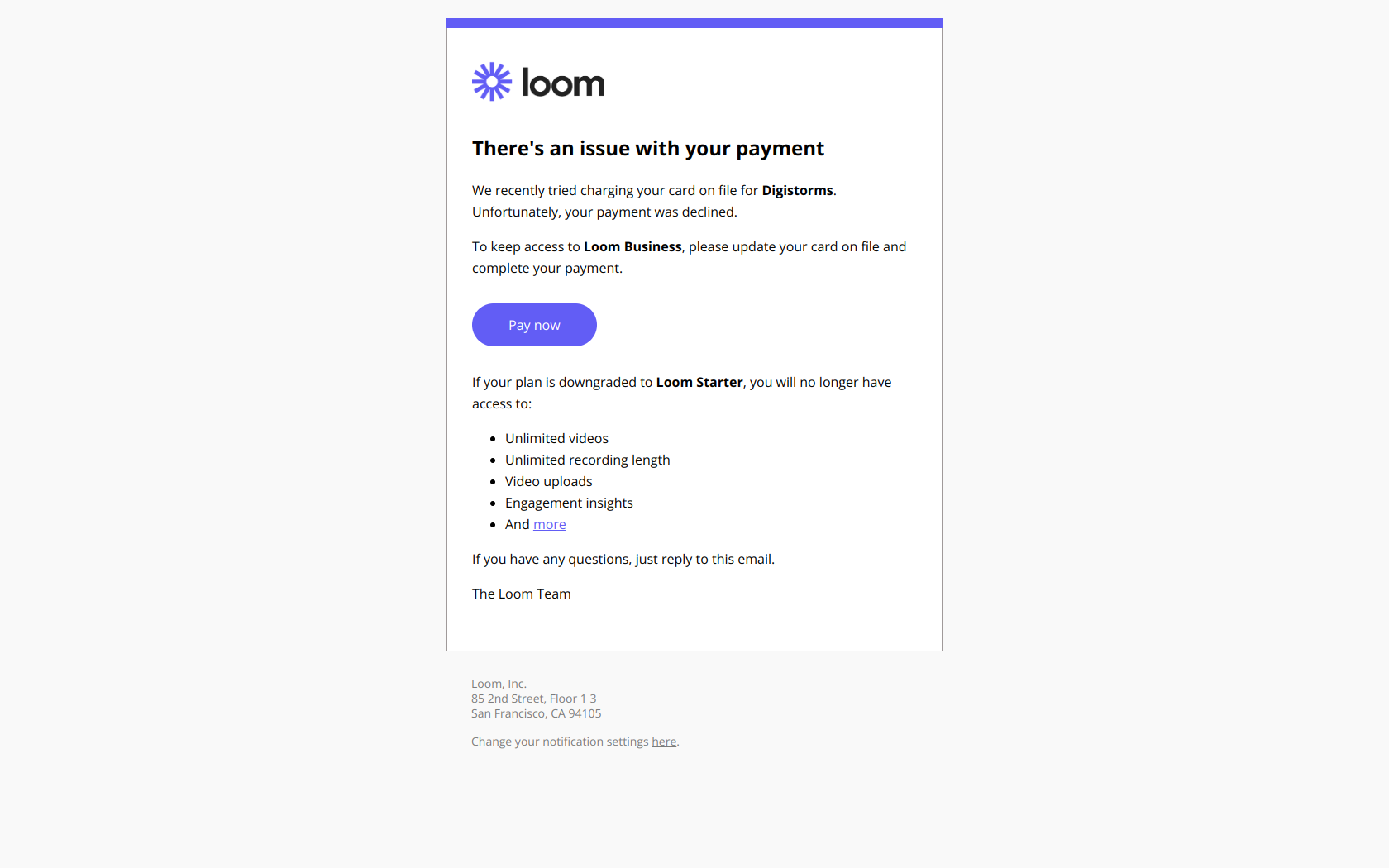
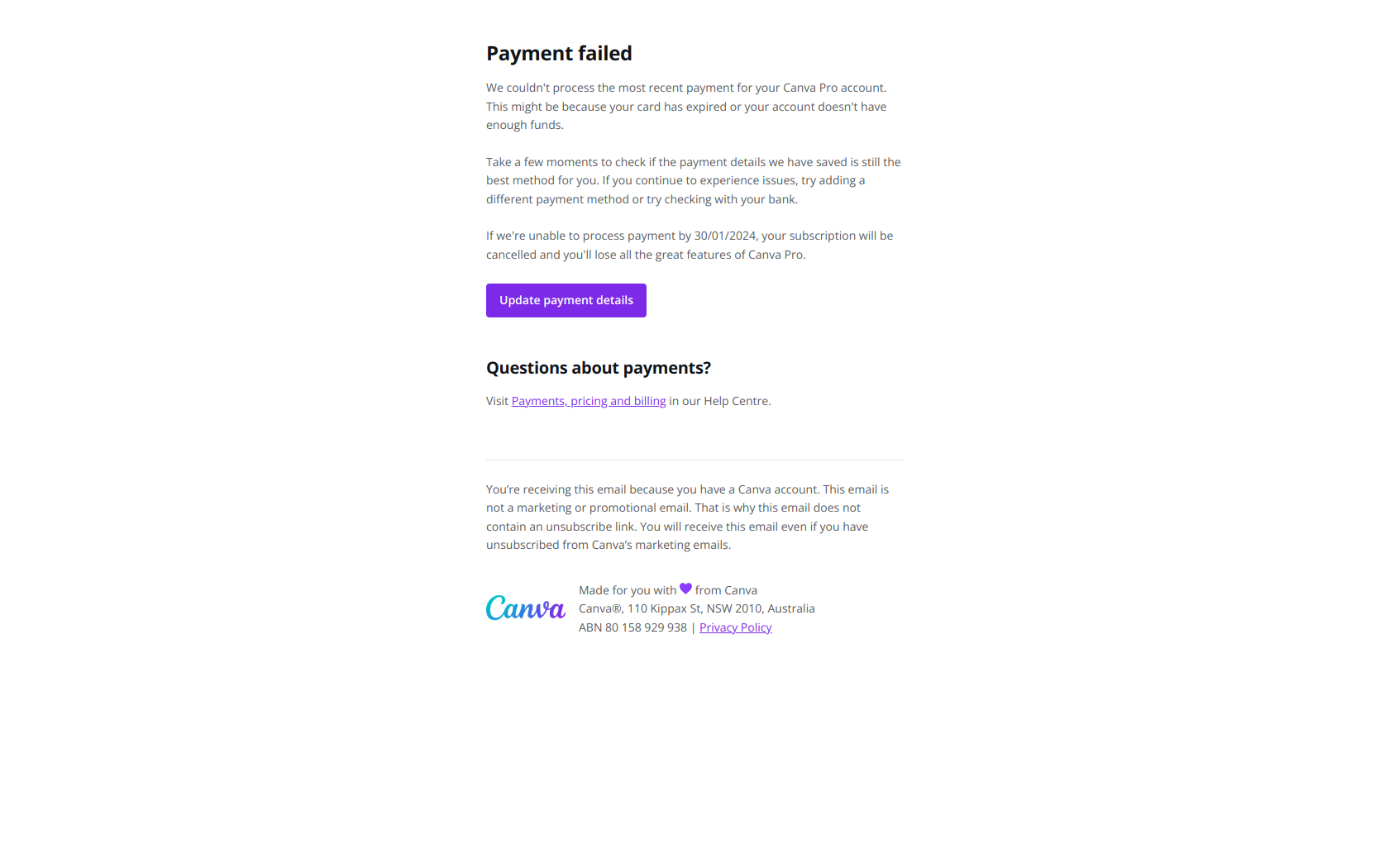
Failed payment (dunning) email examples
Webflow — “Action required: Your payment is past due”
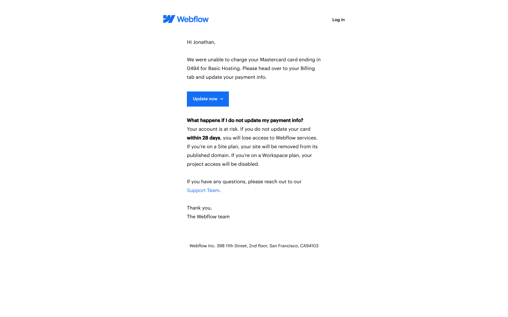
Subject line: Action required: Your payment is past due
Webflow leads with “Action required” rather than “Payment Failed.” It’s a subtle reframe: instead of announcing a service failure, it casts the moment as something the user can control and resolve. The body explains that the Mastercard charge for Basic Hosting couldn’t be processed, links straight to the update-payment page, and clearly states the 28-day window before access is affected.
The pattern: agency before urgency. A failed payment is embarrassing and slightly alarming — leading with the problem (“Payment Failed”) makes the user feel like they’ve done something wrong. Framing it as an action they can take puts them back in control, which is exactly the state of mind you want before asking them to update a card.
Adobe — “Your payment failed”
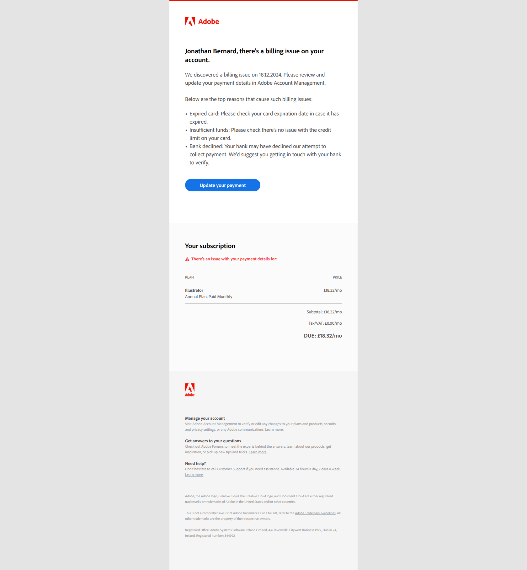
Subject line: Your payment failed
Adobe’s recovery email is specific where it counts. It names the exact payment method (PayPal) and the exact product (an Illustrator subscription), then lists likely causes — expired card, insufficient funds — before offering multiple resolution paths: update payment, manage subscription, or contact support. A user with several Adobe products knows immediately which account to fix.
The pattern: name the broken thing before naming the fix. Customers who juggle multiple subscriptions or payment methods can’t act until they know which one failed. Spelling out the specific product and method up front removes the “wait, which account?” hunt — and the faster a user understands the problem, the faster they recover the revenue for you.
The patterns behind every good transactional email
Across all 12 examples, the same handful of moves keep showing up:
| Job | The move | Examples |
|---|---|---|
| Payment receipt | Gratitude/relationship before the numbers; official language for trust | Buffer, Loom, Calendly, Canva |
| Email verification | Surface the code; offer button and copy-paste; kill competing CTAs | Slack, ClickUp, Stripe, Customer.io |
| Password reset | State the fact calmly; sequence extra security after the reset | Zapier, Make |
| Failed payment | Agency before urgency; name the specific product/method that failed | Webflow, Adobe |
Three principles unify them:
- Confirm first, everything else second. The reader opened for one fact. Lead with it.
- Collapse the distance to done. Codes in subject lines, dual button/link paths, the exact broken subscription named — every removed step lifts completion.
- Borrow the credibility of the system you’re confirming. Plain, official, calm language reads as legitimate; that trust is worth more than any clever subject line.
What every transactional email should include
- A subject line that states the outcome. “Your receipt,” “Confirmation code: 7499,” “Action required.” The reader should know what’s inside before opening — and often be able to act without opening at all.
- The core fact in the first line. The charge, the code, the failed subscription. No hero image or greeting ahead of it.
- One primary action, unmissable. Verify, reset, update payment — a single prominent button, with a copy-paste fallback where a code is involved.
- A trust anchor. Support link, cancel-if-this-wasn’t-you option, or the exact account named. Users need a way to verify legitimacy or bail safely.
- Zero marketing bloat. Keep promotions out of the transactional stream — for deliverability, for legal separation, and for the reader who just wants the one thing they came for.
If you want to see these transactional emails in their natural habitat — full formatting, real inbox rendering, scrollable in browser — browse the DigiStorms email library, where every example above lives alongside hundreds more receipts, resets, and confirmations from real SaaS companies.